My Role
User research
Personas + Journey Mapping
Information Architecture
Brand Refresh
Wireframing + Prototyping
Usability testing


Challenges
The product needed effective navigation for the business' varied offerings and services. The design needed to support the existing product photography, which was shot on iPhone with inconsistent backgrounds/placement.
Lori McLean also had a feature wish list including:
-
A filter function to narrow searches to relevant products
-
Information about brand history
-
Consideration of the brand's environmentally friendly shopkeeping practices
-
A contemporary visual design in keeping with the brand attributes: Personal, timeless, ethical, and aspirational
Process Overview
Card sorting
Sitemap
Task flow
Lo-fi wireframing
Preliminary testing
Iteration
Brand Refresh
Style tile
Mid-fi wireframing
Prototyping
Usability testing
Affinity mapping
Iteration
Stakeholder Interview
+ Existing Product
I interviewed the business owner and studied the design and analytics of the existing product.
-
Company revenue is equally divided between retail sales, custom jewelry orders, and jewelry repair
-
Landing page missed many opportunities for engagement; including a primary call to action, products, and information about repair services
-
Navigation cluttered with numerous options hidden beneath a misleading primary navigation
-
Low engagement with Custom and Repair pages
-
High engagement with wedding-related products
-
Custom services were featured strangely on the landing page, with images that link to nothing
-
Inconsistent product imagery
-
Low contrast font and background colors make site difficult to read

Competitor Analysis
Identifying competitor strengths and weakness provided insight into user expectations and a bank of ideas to make the product stand out. I was particularly excited by Mociun's employee product curation.

"If something arrives and it's not what I was expecting, I'm not afraid to return or exchange it."
“I love that there is a big sale sign right in front of me.”
“It was this cute little shop that I walked by all the time. Those places have the best stuff.”
“We needed it before our wedding and they didn't tell me how long it would take.”
“I don't know what demi-fine means, but it makes the jewelry sound cheap. Is that what it is?”
User Interviews
My interview questions guided the conversation towards:
-
Discovering what drives users to shop for jewelry
-
Understanding user expectations for repair and custom services
-
Determining where the existing product succeeds or fails in meeting user needs
-
Discovering the user’s delights and frustrations with online shopping and the jewelry industry at large
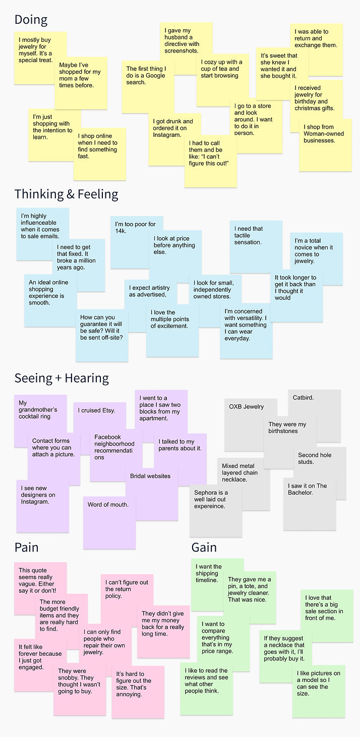
Empathy Map
To gain a deeper understanding of how Lori McLean's users think and feel, I sorted their comments into an empathy map.
User Personas
After analyzing data from my interviews, I synthesized my findings into a set of three user personas.
Their motivations, fears, and personalities will guide my design decisions moving forward.


Each persona has a unique set of needs and approaches when it comes to jewelry. I visualized them by creating a map for their interactions with the product. The new website should help Jess find items in a mid-level price point, while earning David's trust and satisfying Carla's needs for simple navigation.
Customer Journey Maps
Card Sorting
To discover how users group and conceptualize products, I performed a card sorting exercise with a new group of potential users. I asked them to sort bits of information into groups that made sense to them.
Two distinct groups emerged: Fine jewelry (with wedding & engagement related products) and All of the jewelry (with different specialized product categories). I also learned there is friction with the term "Demi-fine jewelry."

Site Map
(Version 1)
When deciding what to include and where, I looked to my personas and research for answers.
I removed the Demi-fine product category because the term confuses less savvy users like David, and sounds cheap to users like Carla and Jess. These products can still be found when filtering by metal or price.
Many users are visiting the site to browse wedding and engagement offerings. I made their search easier by moving this category into the primary navigation.

Task Flow
I imagined a task flow for a typical interaction that Jess Simon might have with the product.
As our primary persona, Jess' needs are a great indicator of the needs of a typical user. Prioritizing her task flow will provide a strong foundation for the product.
.png)
Feature Prioritization
To ensure that my ideas were viable, I checked in with the developer. Implementing account creation will require great effort for only minimal value to the user. I concluded to move forward without it for now and hope to add the feature after our initial rollout.
.png)
Low Fidelity Wireframes
I took both stakeholder and user needs into consideration while creating my wireframes. For example, I included banners on the landing page to advertise Lori McLean's lucrative custom and repair services. There are several opportunities for Jess to browse by price. Carla will save time with a simplified navigation. Copy such as "Established in 1992" was chosen to build David's trust in the brand.


Preliminary User Testing
To confirm that my design was on the right track, I conducted informal usability testing with a new set of participants. I created a clickable prototype using my low fidelity wireframes, and tested the flow by asking participants to explore and choose an item for purchase.
-
Participants struggled to locate repair services in the navigation.
-
No participants explored the "Designers" section in the main navigation.
-
Participants seemed lukewarm about the "New Arrivals" offerings on the landing page. I recalled the employee-curated content that excited me during competitor research and concluded to replace this banner with something similar.
Site Map
(Version 2)
I returned to my site map to address concerns raised in preliminary user testing. I removed "Designers" from the primary navigation and replaced it with a link to repair services. This sends a clear message: this business sells jewelry, facilitates repairs, and creates custom work.
Users may still search by designer using the search function, or by clicking a designers name in a product detail page. I added "Lori McLean Designs" under the shop navigation, as this was something users searched for during the research stage. Changes highlighted in yellow.

Brand Refresh &
Interface Design
The interface design needed to support both the interaction design and Lori McLean's brand attributes. I increased or decreased the saturation of the brand colors to achieve greater contrast. This will put less strain on the eye and allow for color to be used to achieve visual hierarchy. I also gave the logo a contemporary redesign and a more approachable tag line.
I then applied these interface choices to my revised wireframes.
Style Tile


Original Logo
Logo Redesign
Usability Testing
I asked participants to browse and select an item for purchase using my mid-fidelity prototype. As they went along, I asked questions to encourage them to talk about their experience.
I tested for ease of use, noting areas of frustration or confusion, while ascertaining how successfully the design conveyed a personal feel and communicated information about products and services.
I then grouped findings by affinity to discover trends.

Usability Test Findings + Conclusions
The general layout and navigation were a success. Users responded well to the product photography; an indicator that designing minimally had unified the inconsistent imagery by allowing it to speak for itself.
Users experienced friction with the product filters, the information hierarchy on the repairs page, and the amount of copy on the repairs and custom pages.
Based on these conclusions, I made the following updates to my final iteration:
-
Added an option to filter by style or by category, depending on which type of product list is being browsed
-
Copy on repairs and custom pages was edited and streamlined
-
Pricing information was emphasized on the repairs page
-
Repair price list was edited to include the starting price for each type of repair service offered
-
Icons were added to help visualize and break up the detailed information required on the custom page


Looking Ahead
After performing a similar process for any remaining flows, the next step is to hand the design off for implementation. Once the product is launched, I recommend further testing to continue refining the experience.
I would investigate whether users intuitively understand that they may select multiple filter options at once, and look for possible improvements to the product filters.
I am curious how users will respond to the quantity functionality when adding items to their cart. Lori McLean rarely stocks multiples of an item, so purchasing multiples is an infrequent possibility. I might consider adding a feature to adjust item quantity if its absence creates friction for a large percentage of users.
There are several features that may add value, but are outside the scope of the minimal viable product. Account creation, repair before + after photos, and custom case studies would be good areas to explore.
Let's Connect


