Haven
Insurance
Haven sells insurance solutions through regional sales agents. Their primary product is prepared insurance bundles, although they offer individual insurance plans as well.
They are losing business to companies who offer direct-to-consumer sales, and needed a responsive eCommerce website to gain access to that market.
My Role
User research
Personas & task flows
Sketching
Wireframing + Prototyping
Visual design
Usability testing


Challenges
My primary challenge was to rectify Haven’s business model, which is predicated on prepackaged insurance bundles, with the average user’s expectation that a search should begin with individual insurance plans.
Additionally, Haven had a feature wish list including:
-
A filter function to narrow searches to relevant products
-
A system to visually categorize and differentiate products
-
Consideration of future products, such as business insurance
-
A visual design in keeping with Haven’s brand attributes: trustworthy, modern & fresh, clean & clear

“I would prefer to shop for insurance online, but it always feels necessary to call and talk to an agent.”
“I always have to keep handwritten notes to compare plans and it is frustrating.”
“I need the information to be right there because I’m not going to look anything up.”
“I always feel like I’m going to forget to add something that I need.”
“Fine print terrifies me.”
User Interviews
My interview questions guided the conversation toward:
-
Determining which insurance products are most important to the user
-
Understanding the user’s expectations when shopping for insurance online
-
Determining where users are currently turning for insurance solutions
-
Discovering the user’s likes and frustrations with online shopping and the insurance industry at large
Empathy Map
To gain a deeper understanding of how Haven's users think and feel, I sorted their comments into an empathy map.

Primary User Persona
Meet James Sherman.
We're going to help him find insurance
After analyzing data from my interviews, I created a persona for our primary user. James’ motivations, fears, and personality will guide my design decisions moving forward.

Card Sorting
Next, I wanted to discover how users group and conceptualize features and products.
I performed a card sorting exercise with a new group of potential users. I asked them to sort bits of information into groups that made sense to them.
Three distinct groups emerged: Things to learn/read, things to search/do, and insurance products.

Site Map
With consideration to how users grouped information in the card sorting exercise, I organized my core features into a sitemap.
When deciding what to include and where, I looked to my primary persona for answers. For example, James feels he may need to contact Haven to clarify details before making a purchase. To ease his mind, I provided easy access to customer service with an ever-present contact tool.


Task Flow
I identified James' primary task flow and mapped each step necessary to meet his needs, as well as the needs of business.
For example, James will have a simple way to compare plans within the product; sparing him the hassle of taking handwritten notes. To promote Haven’s insurance bundles, I included an option to browse bundles with a chosen individual plan before checkout.
Low Fidelity Wireframes
On the landing page, I addressed many of Haven’s feature requests. There is an area advertising their upcoming launch of business insurance, and a banner inviting users to browse product bundles.

Preliminary User Testing
To confirm that my design was on the right track, I conducted informal usability testing with a new set of participants. I created a clickable prototype using my low fidelity wireframes, and tested the flow by asking participants to find a plan.
-
The plan comparison tool was discoverable, but users found it confusing. I adjusted the button copy to better reflect functionality and concluded to implement enabled/disabled button states.
-
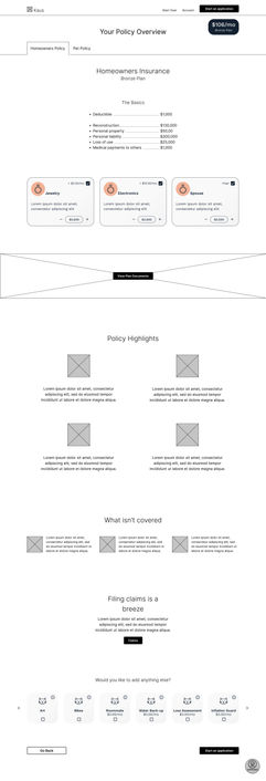
There was friction with the information hierarchy on the plan overview page. I adjusted accordingly to better meet user expectations.
Interface Design
The interface design needed to support both the interaction design and Haven’s brand attributes. For inspiration, I compiled a mood board with colors, imagery, and font pairings evocative of trust, freshness, and clarity. I then created a palette for my interface design in the form of a style tile and a UI kit.


Mid-Fidelity Wireframes
I iterated on my prototype to address issues uncovered in the preliminary usability test, and applied the interface choices developed in the style tile and UI kit.


Usability Testing
I asked participants to find and purchase a homeowners insurance plan using the mid-fidelity prototype. As they went along, I encouraged them to talk about their experience.
I tested for ease of use, noting areas of frustration or confusion, while ascertaining how successfully the design empowered participants to make decisions from a place of trust.
I then grouped findings by affinity to discover trends.

Usability Test Findings + Conclusions
The general layout and navigation were a success and the UI appeared to be in line with the brand attributes (straightforward, contemporary, fresh, & trustworthy).
Users experienced friction on some pages regarding the level of information available and the use of pagination to display product cards.
Based on these conclusions, I made the following updates to my final iteration:
-
Pagination was scrapped in favor of lazy loading
-
Info icons were added to the additional coverage product cards
-
A “learn more” button was added to the plan overview basics
-
Bundles and plan documents banners were redesigned for increased visibility
-
Sticky contact button was redesigned to more clearly communicate the options available there.
Looking Ahead
After performing a similar process for any remaining task flows, the next step is to hand the design off for implementation. Once the project is launched, I recommend further testing to continue refining the experience. I am curious to see how a wider audience responds to the design, particularly the areas updated in my final iteration.


